
Overview
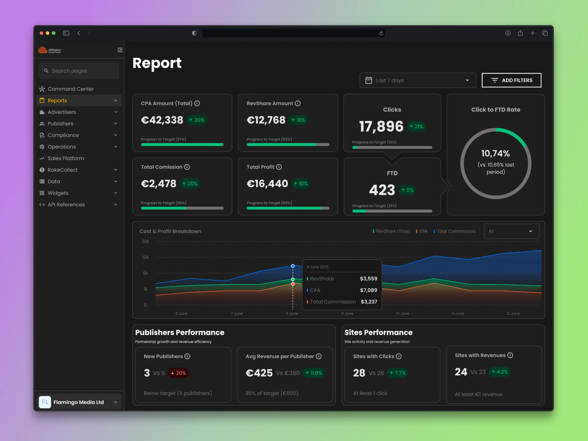
Affiliation Cloud runs an iGaming affiliate company's relationship with the partners who monetize its casino and sports betting brands. One product, two audiences: Publisher (light, external partners) and Admin (dark, the company's internal sales and marketing teams).
Publisher first, then the bigger problem: Admin.
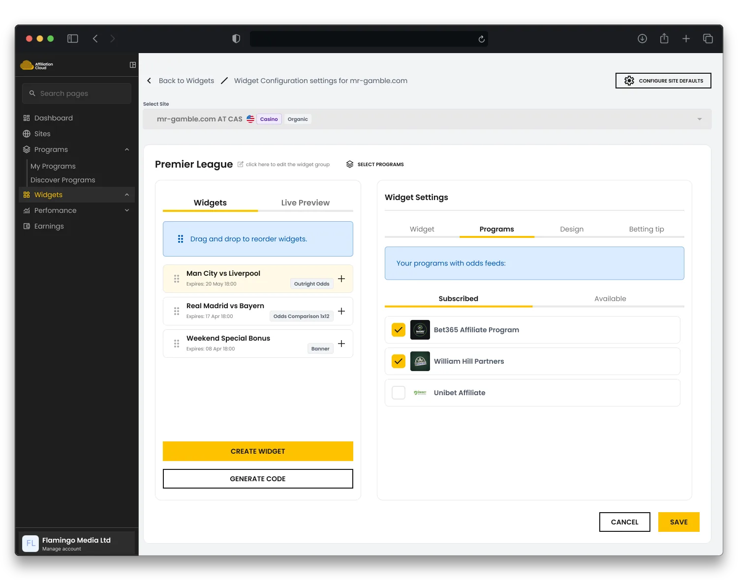
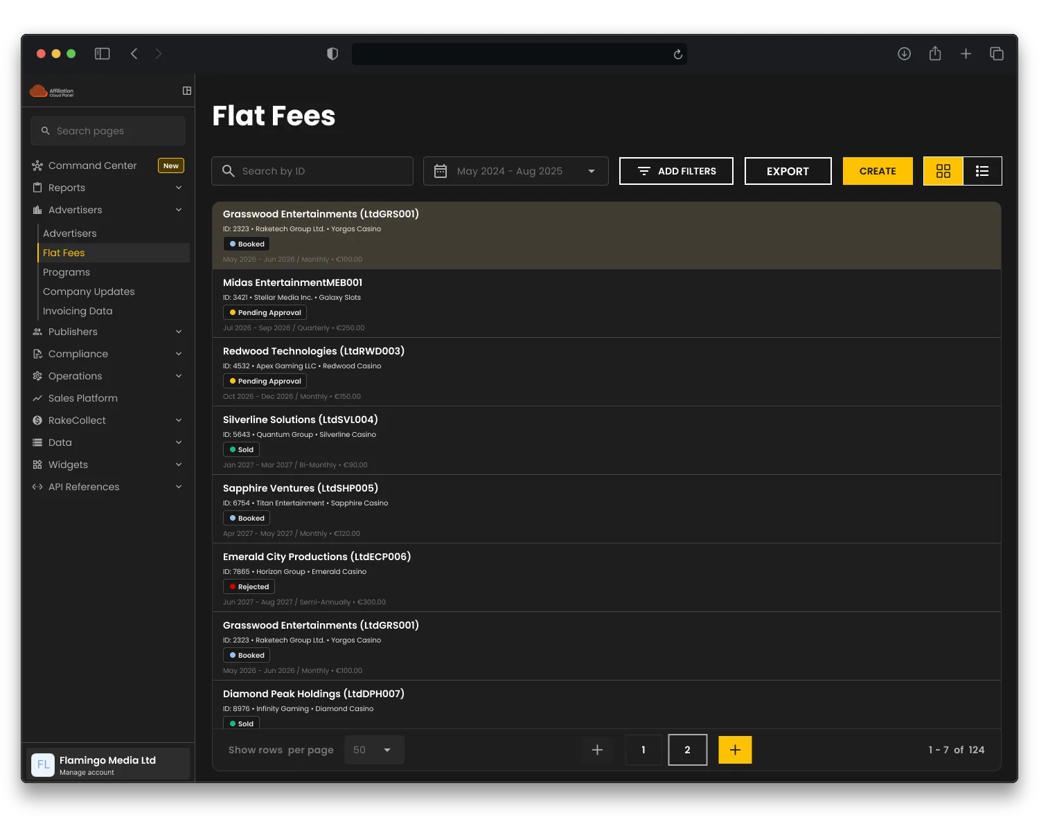
One product, two audiences — Publisher (light) and Admin (dark), same nav shell either side.
Problem
Publisher's navigation held seven links, total. It worked. It just hadn't been designed; it had accumulated.
Admin was worse: deal requests, flat fees, sales pipelines, three workflows that grew independently, each with its own screen and its own status logic. "What needs my attention today" meant checking three places.
Four real constraints shaped every decision:
Process
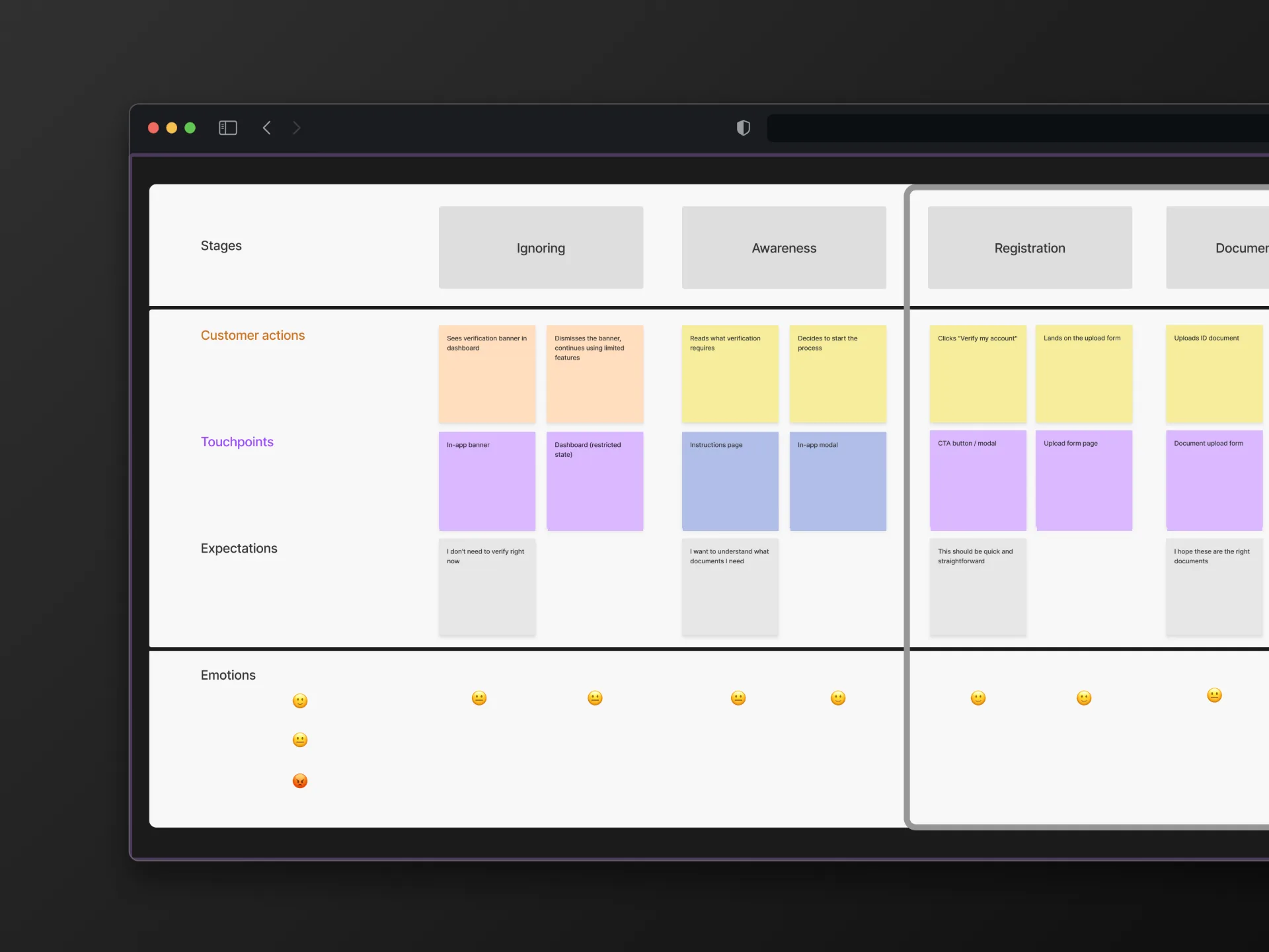
Publisher: a year of research with daily users turned into real information architecture, not a flat list, plus an onboarding flow built around one goal: a new publisher's first real result, fast.
Admin: audited the legacy system, simplified it, built the real interface on top as I went, rather than finishing a "perfect" system first.
Both sides: prototype before polish. A page this big skips too many unresolved questions jumping straight from a Jira story to a Figma mock. Build a working prototype first, settle features and layout with the team, then make it the real design. Cheaper to iterate on, and it settles arguments a static mock can't. Sales Platform and Command Center, below, both went through it.
One habit throughout: before calling anything done, a deliberate pass for cases I'd designed around without noticing. It caught real gaps on Sales Platform, more below.
Solution
From a spreadsheet to a system of record
Sales ran on an Excel “Sales Bible,” bridged by hand into a bidding engine over Slack: no automation, no audit trail. A first reskin shipped and was rejected as generic.
Rebuilt the board’s IA: a peek-rail compresses past months into a scannable strip instead of a dropdown, a frozen-axis rate-card column stays legible while the board scrolls beneath it.
Paging between months, reordering a slot, then opening a sale and the month's shared notes, all without leaving the board. The rate-card rail (left) stays fixed while the months move
Command Center: one place for what needs attention
Deal requests and flat fees lived on separate screens with separate status logic: Account Managers and Operations checked two places just to answer “what needs my attention today.”
Command Center pulls both into one filterable Inbox and a per-workflow Kanban Board: one answer instead of two.
The Inbox: every open task across both workflows in one filterable list, opening a row slides in a detail drawer without leaving the list
One drawer, every workflow
Long, centered modals blocked the table behind them, reinvented separately on every admin screen: tabs, publisher info, a growing subrequests list, a “Send Back”/“Complete” pair, all crammed in.
Every one now opens the same right-docked drawer: one shared pattern, applied everywhere. Fields sit in named sections, the table stays visible behind it, and a stepper (named stages per workflow) sits up top.
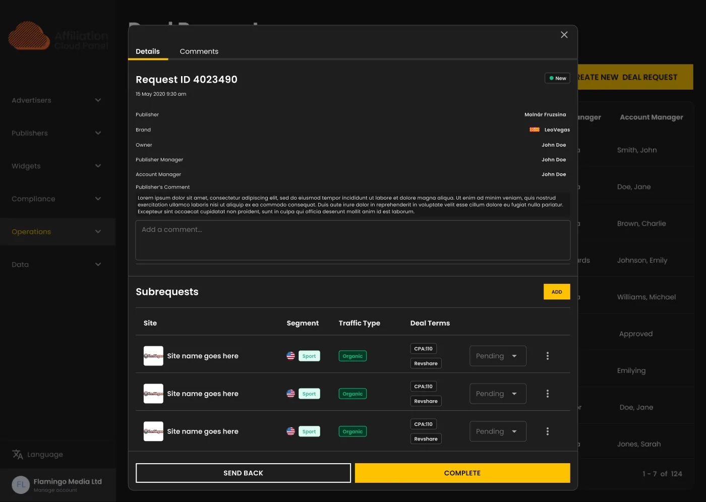 Before: a centered modal, tabs and a subrequests table crammed inside, the table behind it fully blocked
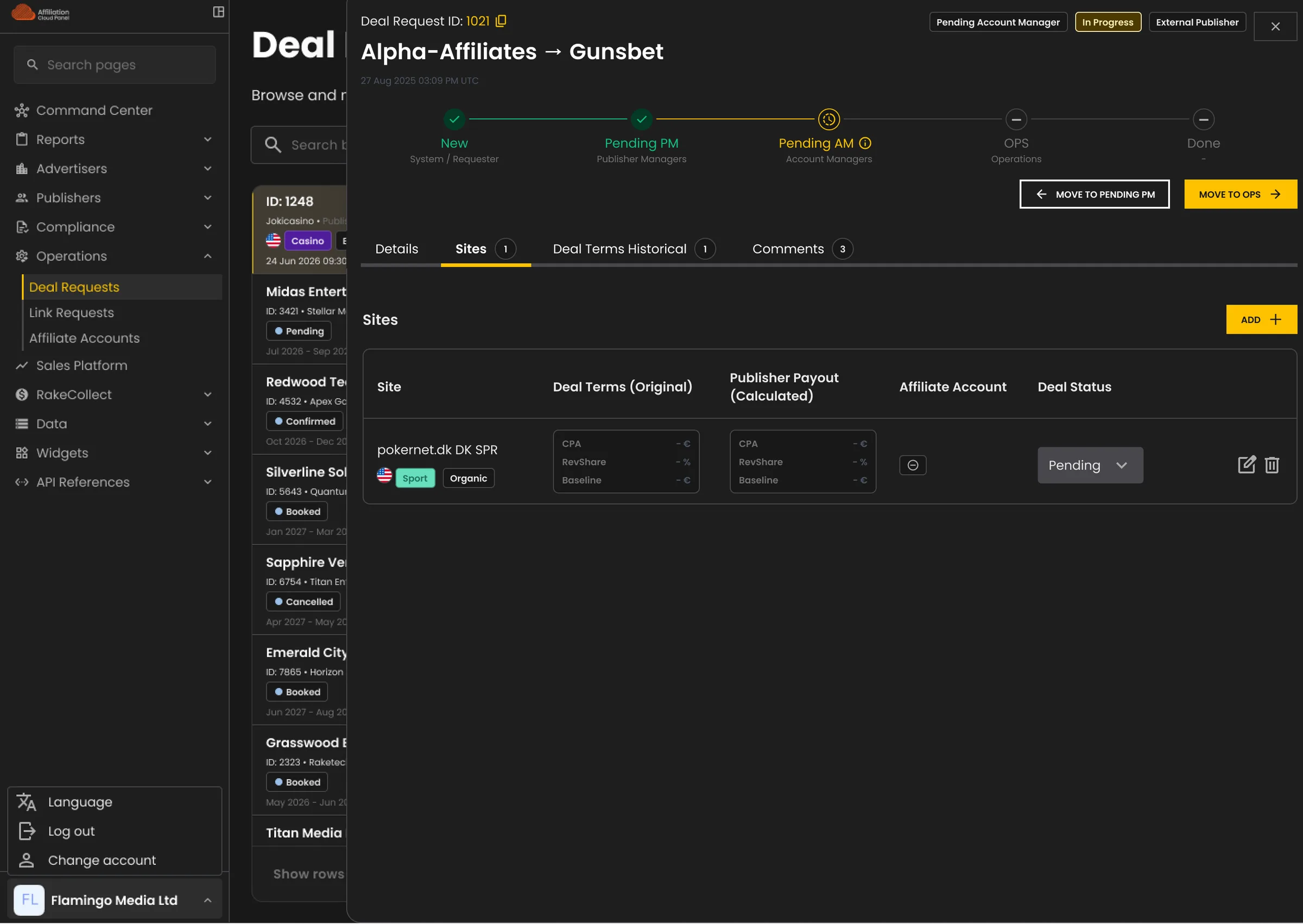 After: the same Deal Request, now a right-docked drawer, stepper up top, its own Sites tab for deal terms per site, table still visible behind it
Opening a row anywhere on Admin surfaces the same card layout (Parties, Commercial Terms, Site Allocation), regardless of which screen it opened from. Learn to read a deal once, read it anywhere.
Design System
Admin's design system started as almost nothing. I audited it, simplified it, expanded it alongside live feature work, built for what the product needed next.
Publisher and Admin share the same tokens, not two tuned palettes: build a component once, it reads correctly on both themes. Publisher's own dashboard proves it: one screen, one build. Drag across the boundary and every surface, border, chart fill, and status colour resolves to the other theme, nothing swapped by hand.
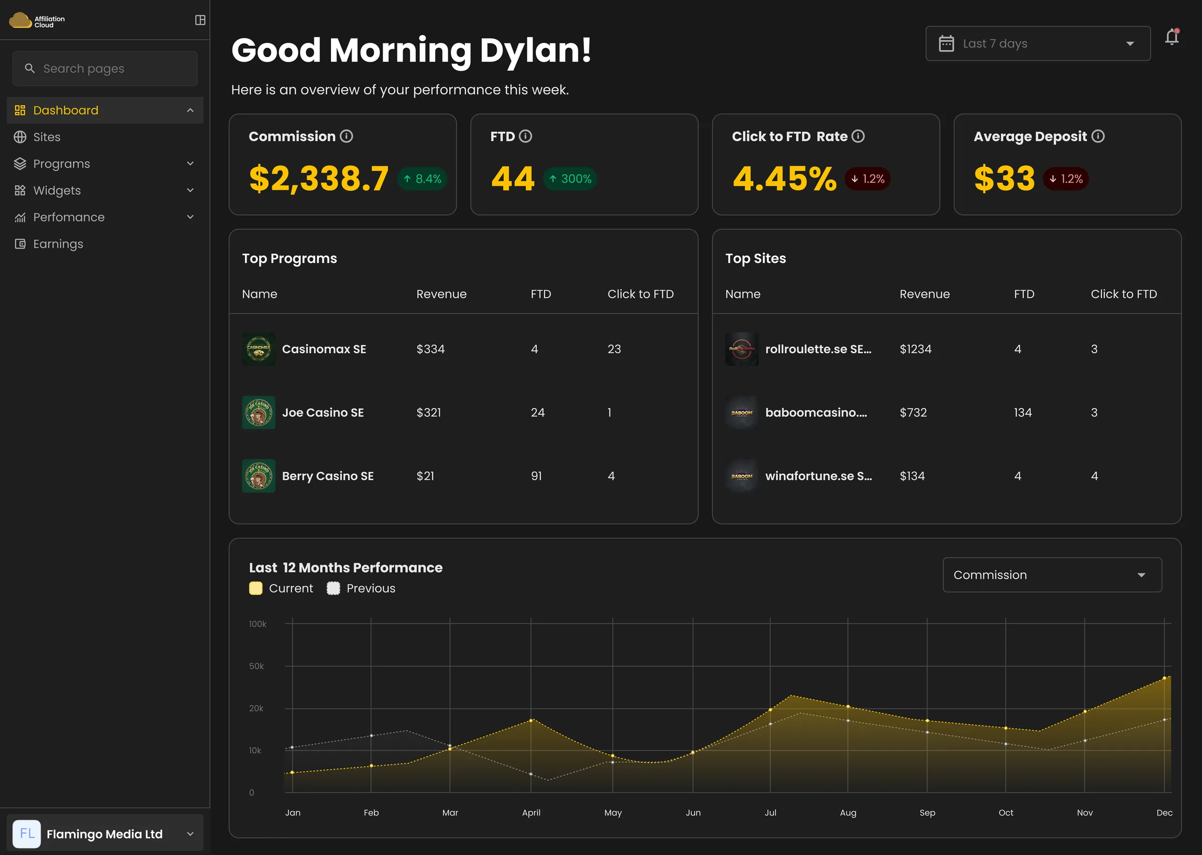
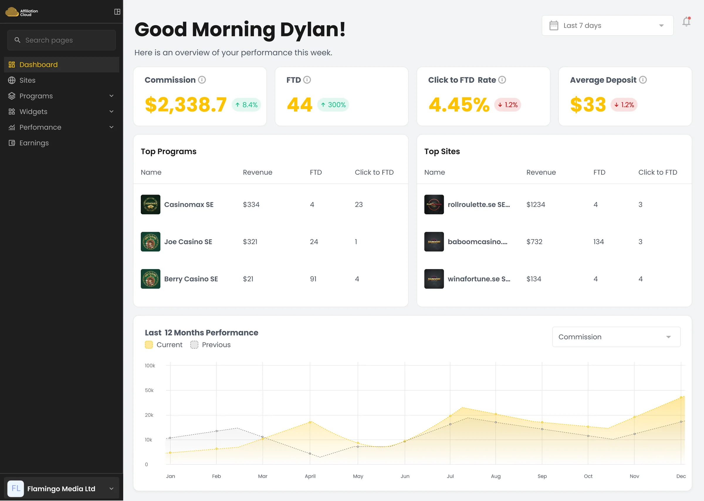
Publisher's real dashboard, light and dark: drag to cross the boundary. Surfaces, borders, chart fills, and status colours all resolve per theme, nothing guessed afterward.
One name, two values.
These aren't guessed per theme: 7 of the 15 Surfaces tokens, each one resolving to a light and a dark value from the same Figma variable collection, verified side by side rather than eyeballed separately.
#e46464 is destructive-hover in light and destructive-hover-2 in dark: the same value, two different jobs depending on the theme, which is exactly why these are named for what they do, not what they look like.
Retrospective
The Publisher onboarding and activation work moved a real number: activation rate up 18%.
Business priorities set the real scope, like on any real product. Rolling the same drawer pattern out across Command Center, Deal Requests, and Flat Fees took longer than fixing just the one screen that prompted it, but it's what kept the system from splintering back into three conventions.
The throughline: don't stop at "it looks right." Sales Platform looked right and still failed, it didn't match how the team actually worked. Both times, the fix was checking structure before trusting polish.