
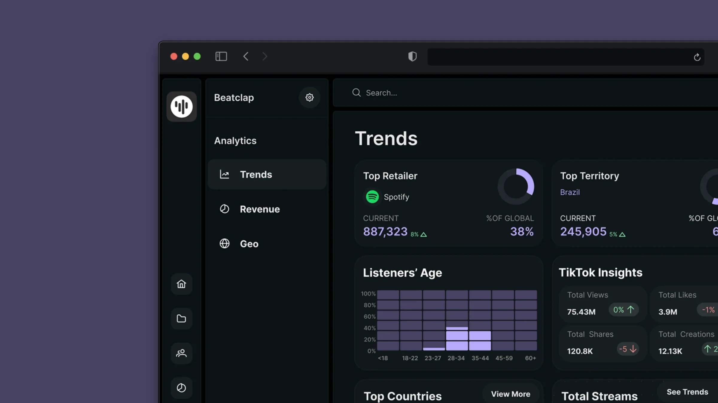
One home for releases, royalties and merch
Beatclap gives record labels and independent artists one place to manage releases, royalty splits, and merch, instead of the spreadsheet-and-email patchwork most of the industry still runs on. Designed end to end as part of a two-person freelance design team, across web and iOS.
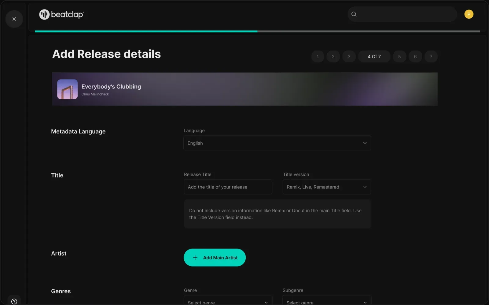 Fig. 01: The release wizard, metadata, titles and artists in a guided 7-step flow.
Artists didn't fear complexity, they feared irreversibility
Metadata, release scheduling and royalty splits lived across disconnected tools. Small mistakes cascaded into payment and distribution problems.
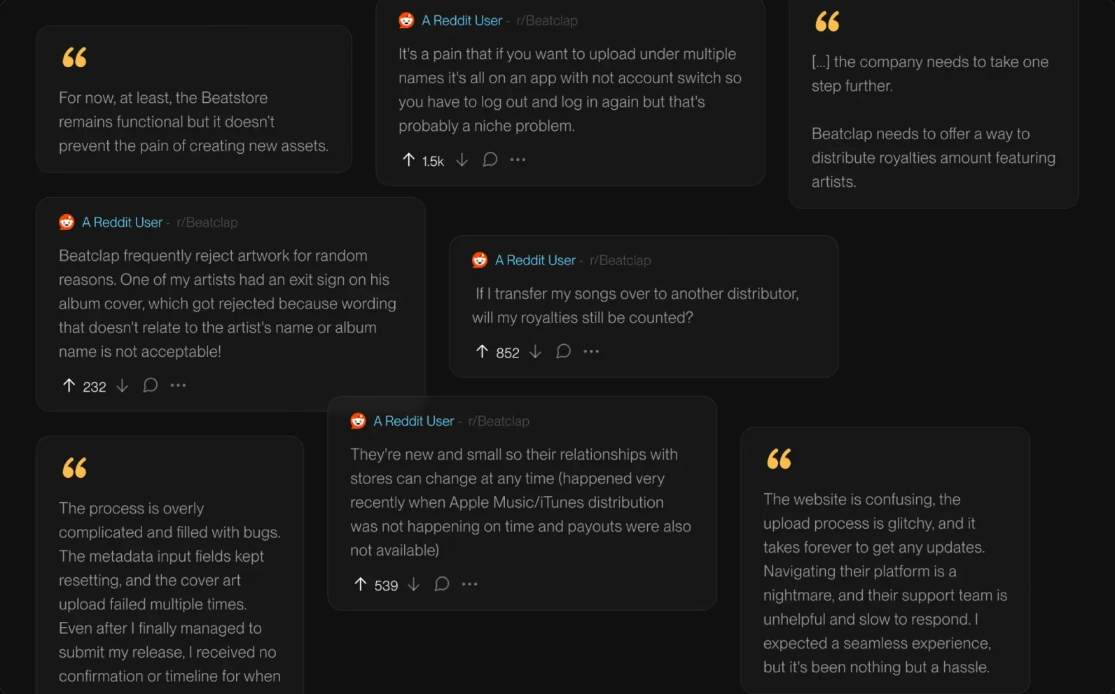
Before touching the UI, I mined public threads on failed uploads, opaque royalty transfers, and unanswered support queues, then clustered them into a journey map. The pattern: artists didn't fear complexity, they feared irreversibility. Every decision traces back to that, make the correct path easy, the wrong path hard.
“The process is overly complicated and filled with bugs… even after I finally managed to submit my release, I received no confirmation or timeline.”
Independent artist, public forum thread (one of dozens clustered during discovery)
Understand the problem before touching pixels
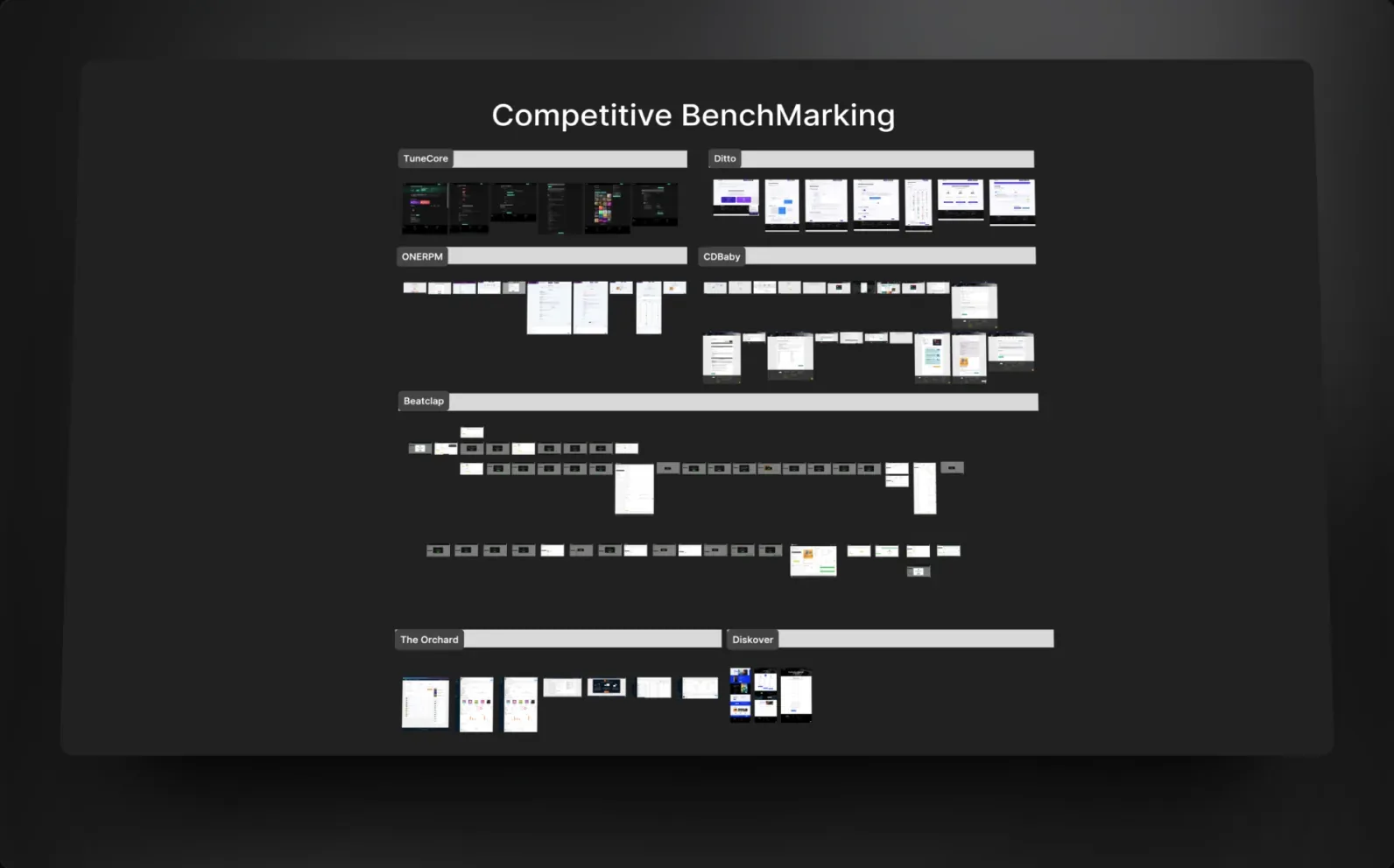
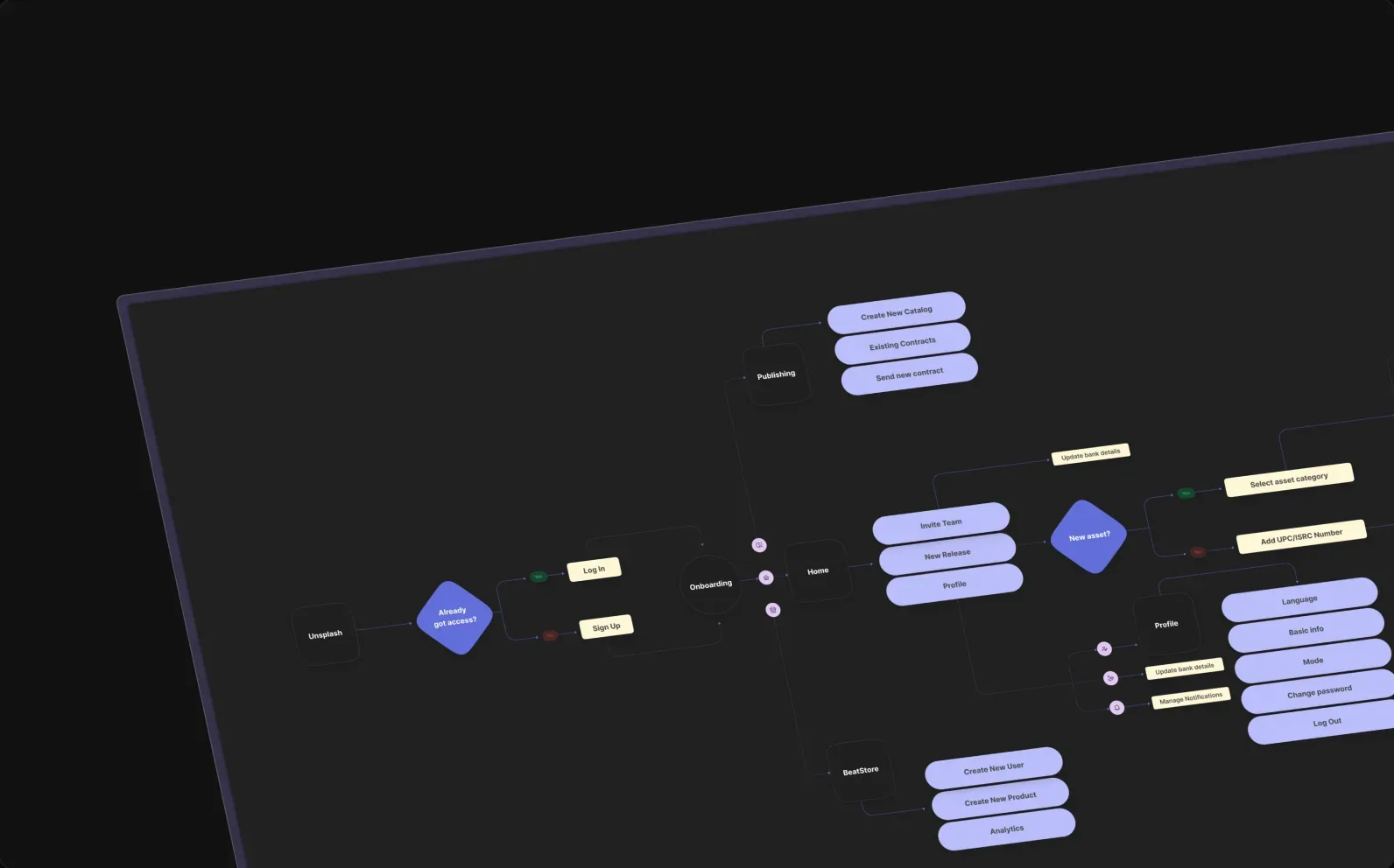
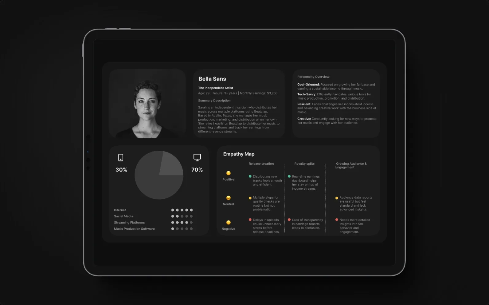
Competitive benchmarking set the bar. Journey mapping turned complaints into addressable moments, a jobs-to-be-done lens kept every screen anchored to what artists actually hire the platform for. Flows were pressure-tested on paper before a pixel was polished.
Understand the problem before touching pixels
Competitive benchmarking set the bar. Journey mapping turned complaints into addressable moments, a jobs-to-be-done lens kept every screen anchored to what artists actually hire the platform for. Flows were pressure-tested on paper before a pixel was polished.
Five surfaces. One component language
Simplified access to content
Contracts, rights and payees for every release lived scattered across spreadsheets and email threads, with no single place to check who was owed what, or whether an agreement was still active.
One structured, scannable table lists every contract by title, ID, type and payees, with a live status indicator and bulk actions like export or deactivate: checking a right or a payee split is a lookup now, not a search.
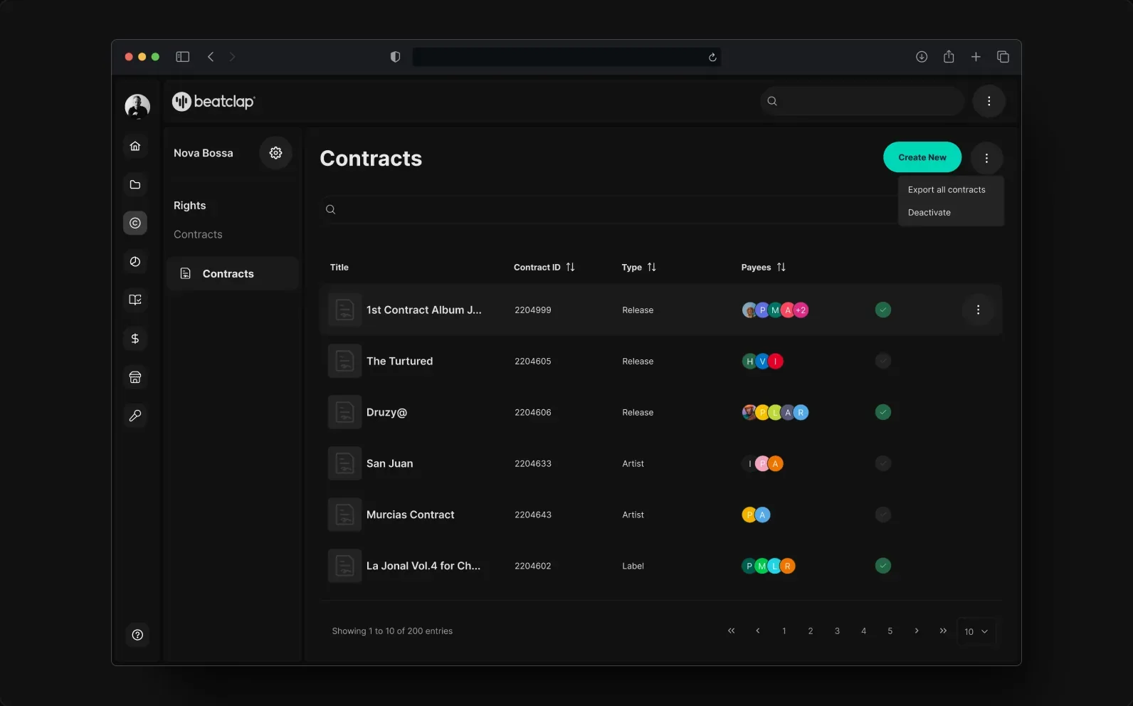 Contracts list: every agreement by title, ID, type and payees, with status and bulk export/deactivate actions
Catalog, release creation, the merch store, a label-level overview, and contracts now share one component language instead of five. Fewer new decisions per screen for returning users, and every action gives real, visible feedback, directly answering the "did this actually work" anxiety the research surfaced.
Mobile-first, step-by-step
Putting a release together meant getting asset type, metadata, and every track right in one sitting, desktop-only, with no sense of how far along you were or whether you could stop and come back.
The release flow is broken into clear, manageable steps: pick asset types, add metadata, upload tracks from any device. A visible progress bar keeps every step scoped to one decision, so nothing feels like a black box.
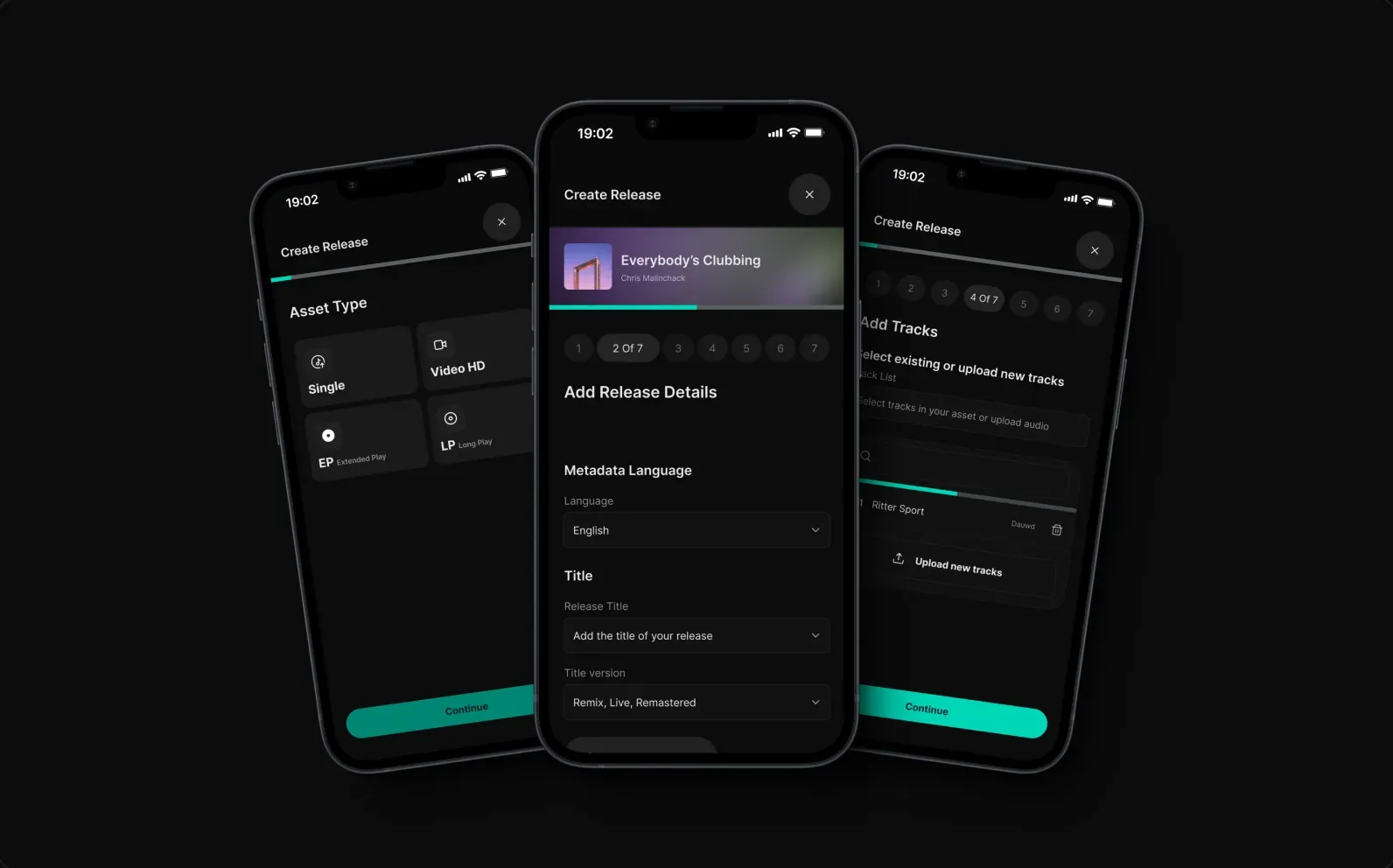 Create Release on mobile: pick an asset type, add release details, then add tracks (the same seven-step flow, on any device)
Every platform's numbers, one view
Streaming and royalty performance lived spread across Spotify, Apple Music, YouTube, and TikTok's own dashboards: seeing how a release was doing meant checking each platform and comparing by hand.
One Trends dashboard pulls total streams, per-platform breakdowns, top territories and TikTok performance into a single view, so a label can see how a release is doing without leaving Beatclap.
Trends dashboard: total streams and per-platform breakdown (Spotify, Apple Music, YouTube Music), scrolled top to bottom
No fluff. Consistent and scalable.
A tight token set, reusable components, and clear states, built so the product could grow without the UI drifting. Standard layout grids and breakpoints kept design and build consistent from small screens to 1920px+, the component set carried one visual language across web and iOS.
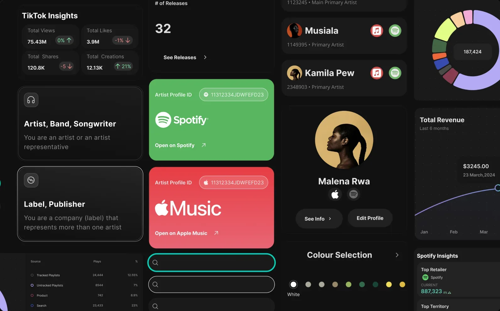 Fig. 05a: Colour, type and component library.
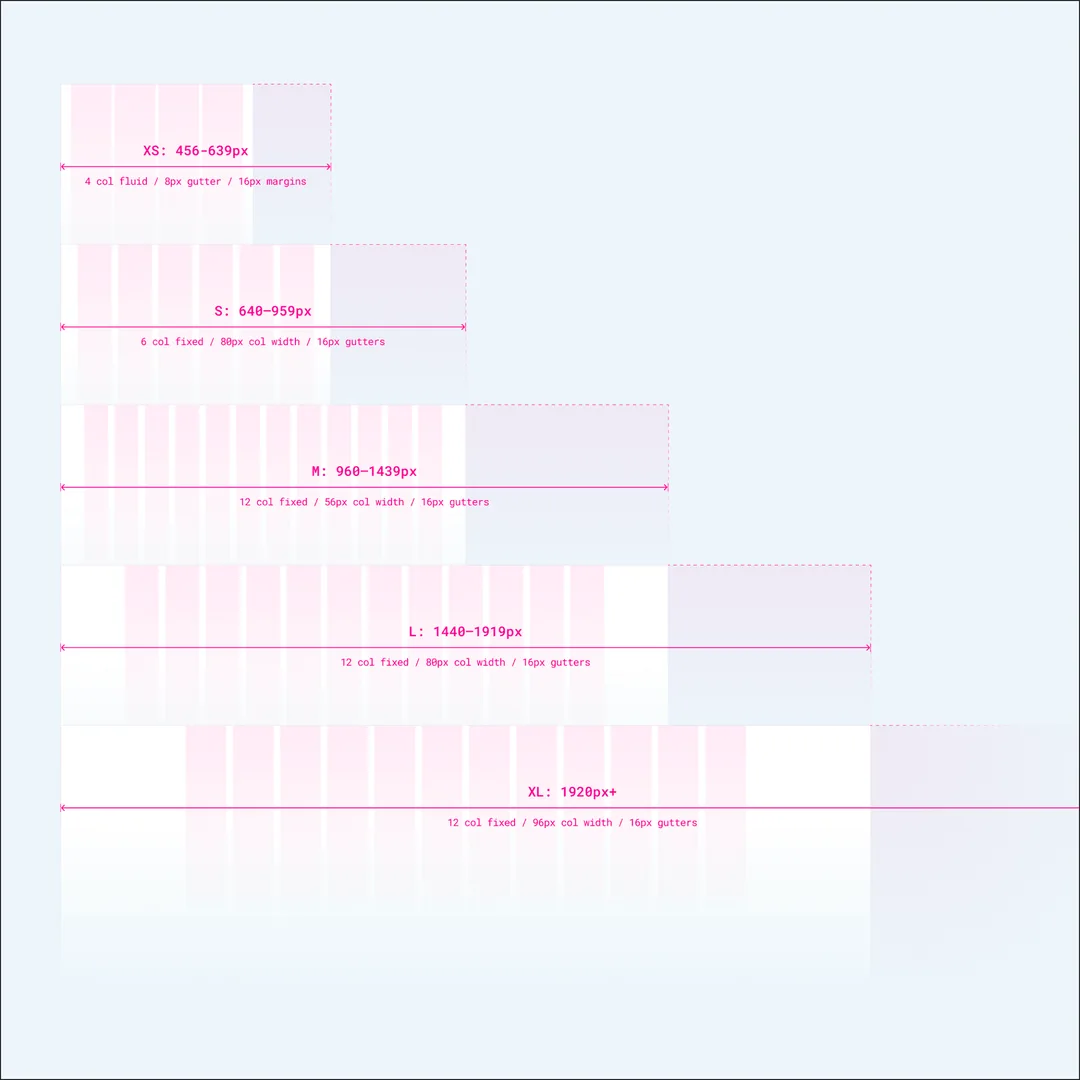 Fig. 05b: Grid spec, 4-col fluid at XS to 12-col fixed at 1920px+.
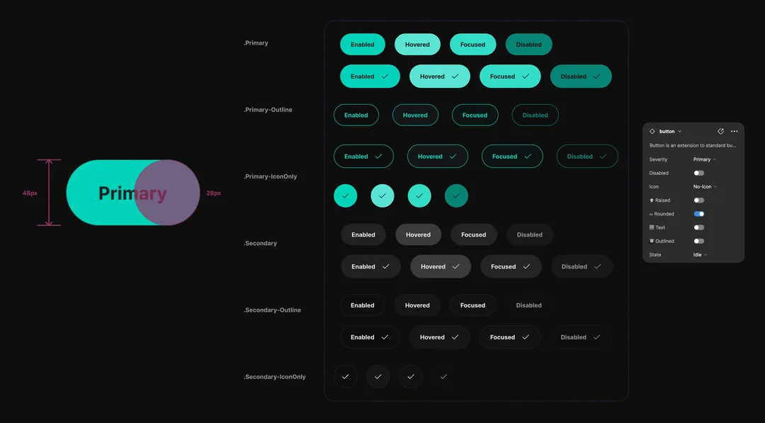 Fig. 05c: Button set, severity, state and icon variants with sizing spec.
Shipped early. The numbers followed
The redesign launched ahead of deadline, and the numbers moved with it: active users +30%, retention +15% in the months after relaunch. The community's biggest request became the platform's strongest feature.
The real lesson: the constraints, a fragmented legacy process, two designers covering a full product surface, forced a focus on shared patterns over one-off polish. That's what made five flows feel like one product.