
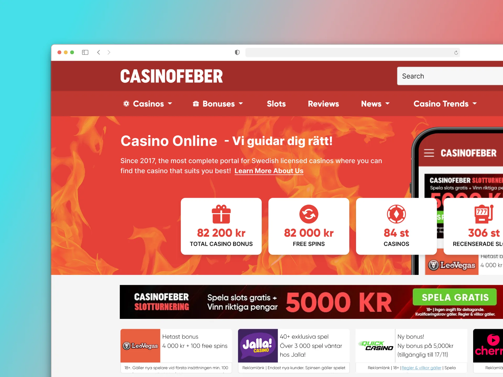
Overview
CasinoFeber is a Swedish online casino comparison site: players compare bonuses and reviews, then click through to an operator. High traffic and CTA engagement weren't the question, conversion was: clicks weren't translating into outcomes the numbers suggested they should.
This is the discovery phase of a UX audit: competitive benchmarking, personas built from real search and comparison behavior, session data analyzed to find where intent was dropping off, before any redesign.
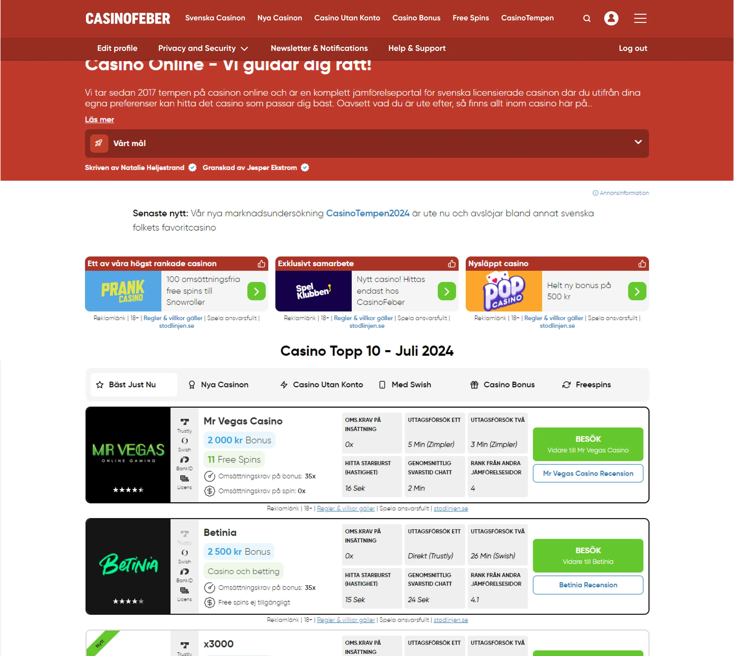 CasinoFeber homepage as it stood going into the audit: the hero, promo cards, and the Casino Topp 10 comparison table
Problem
The brief was blunt: high CTA click rates weren't leading to higher conversions, and nobody could yet say why.
Session recordings and heatmaps from Microsoft Clarity (Aug 30–Oct 5, 2024) were segmented by intent and visit type, new vs. repeat, low vs. high intent, then matched against real persona behavior. A pattern showed up early: new visitors browsed quickly and left without engaging, overwhelming information and unclear navigation. Even engaged repeat visitors struggled to compare what mattered most, bonuses, wagering requirements, game variety, because nothing put it side by side.
Process
Four lenses before any redesign: what competitors do, who the users are, what they do on the site today, what the business needs answered. Mapping the current login and sign-up flow end to end kept it grounded in what exists, not assumptions.
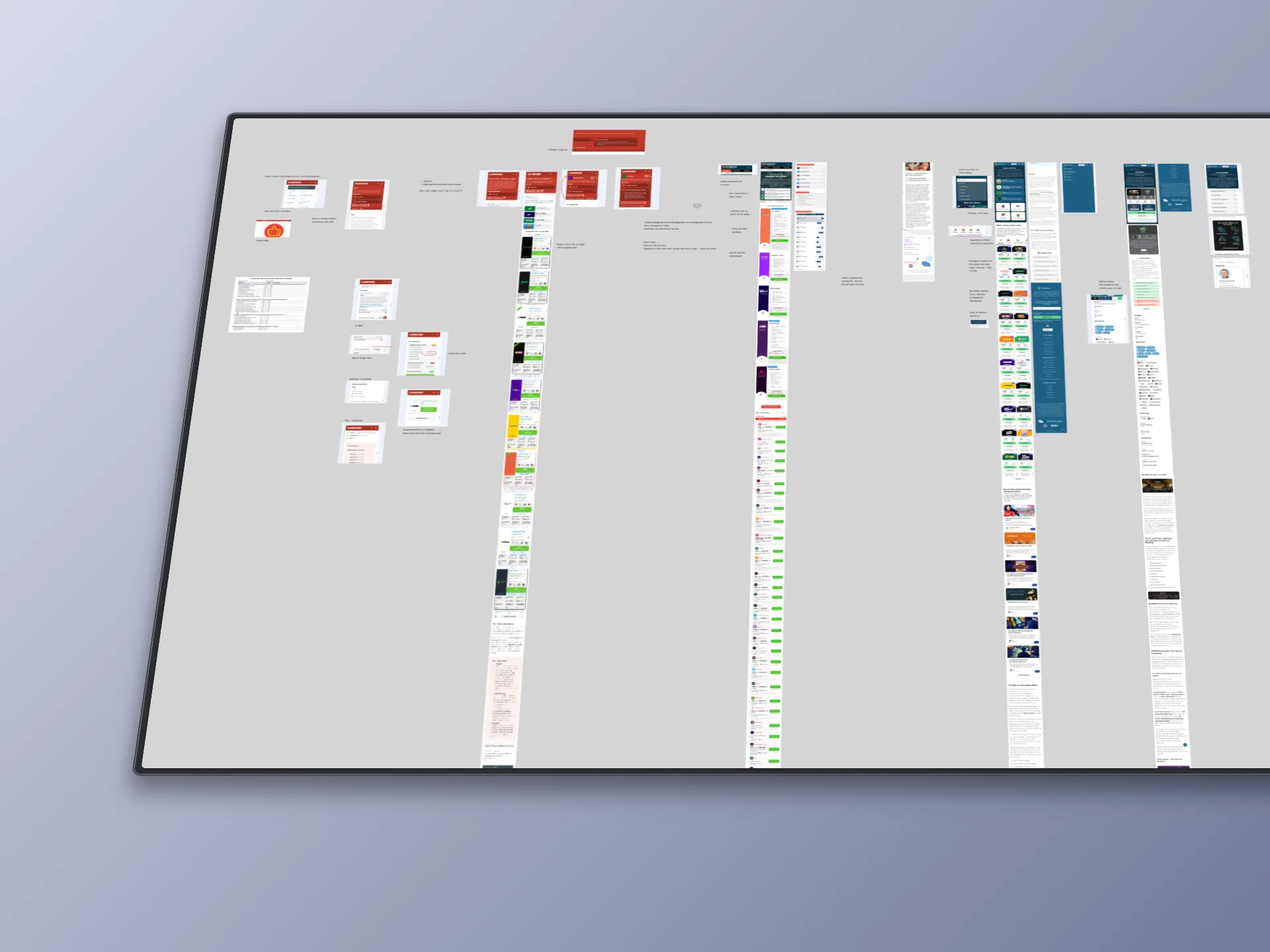
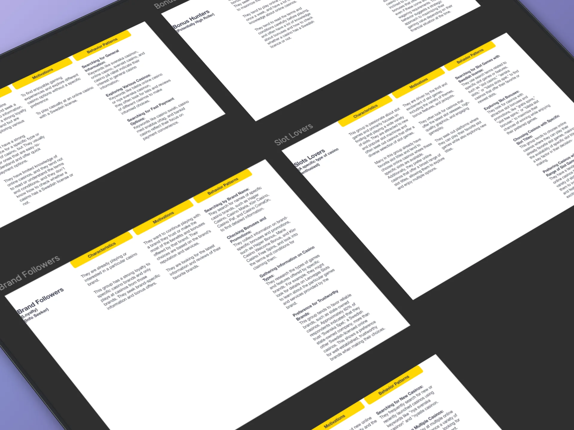
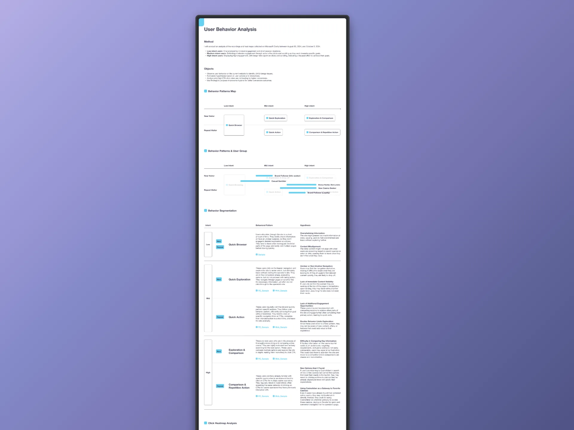
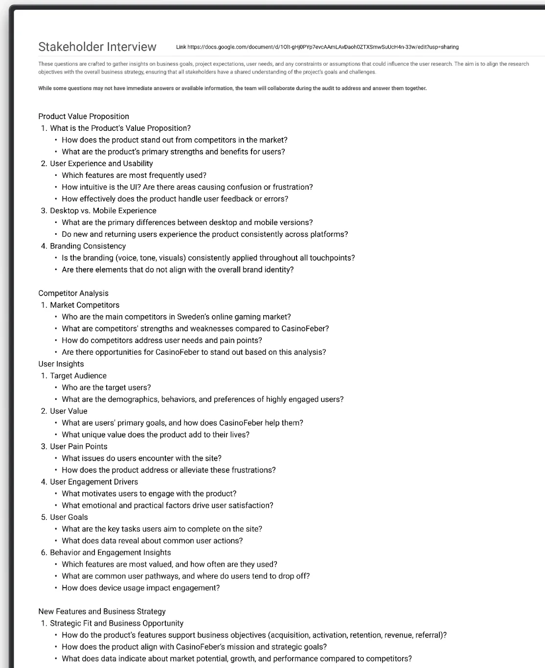
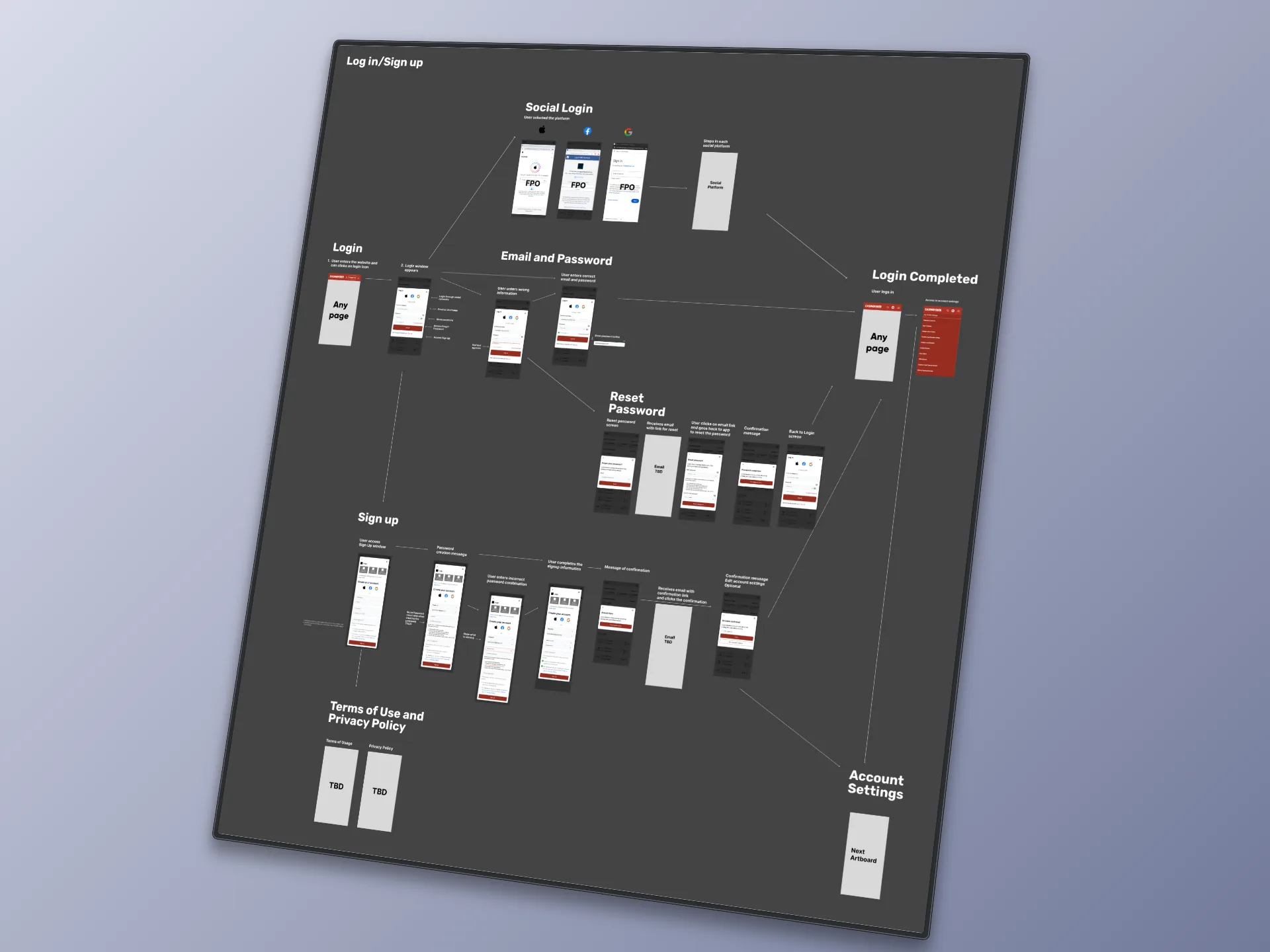
Competitive benchmarking, personas, behavior analysis, the stakeholder interview, and the current login/sign-up flow mapped end to end: the five real artifacts behind the audit
Process
Four lenses before any redesign: what competitors do, who the users are, what they do on the site today, what the business needs answered. Mapping the current login and sign-up flow end to end kept it grounded in what exists, not assumptions.
Competitive benchmarking, personas, behavior analysis, the stakeholder interview, and the current login/sign-up flow mapped end to end: the five real artifacts behind the audit
Solution
A real comparison table on the homepage
Comparing bonuses, wagering requirements and payout speed meant scanning near-identical banner ads: nothing put the numbers side by side, and four equal-weight promotions gave no clear entry point.
A real comparison table, Casino Topp 10, now sits on the homepage: rating, bonus, wagering requirement, deposit/withdrawal time per casino, filterable by newest, no-account, Swish, bonus type, free spins. Two larger featured placements lead the page instead of four identical banners.
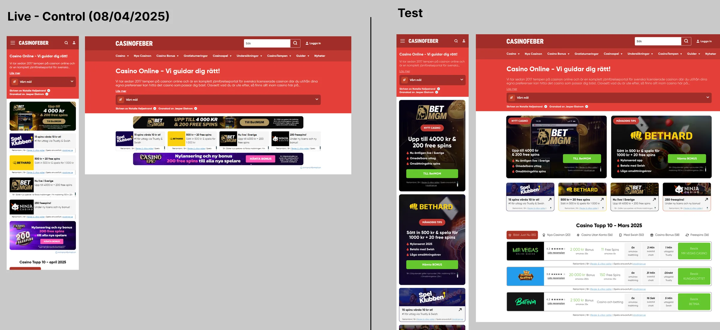 Live control versus test: the existing homepage next to the version with two featured casino placements and the new Casino Topp 10 comparison table
This ran as a live A/B test against the existing site. The direction held up well enough to move forward on, full conversion numbers are still coming in.
The compare tool's own hierarchy
The compare tool buried its most decisive field, total rating, under half a dozen supporting rows, with no path back to the casino itself, only a review link. Visitors comparing casinos still had to leave the table to act.
Total rating now leads the Ratings block, with a real 'Till Casinot' call to action and terms on every compared card, plus a page title and Back link, so the tool no longer drops visitors in with no sense of where they are.
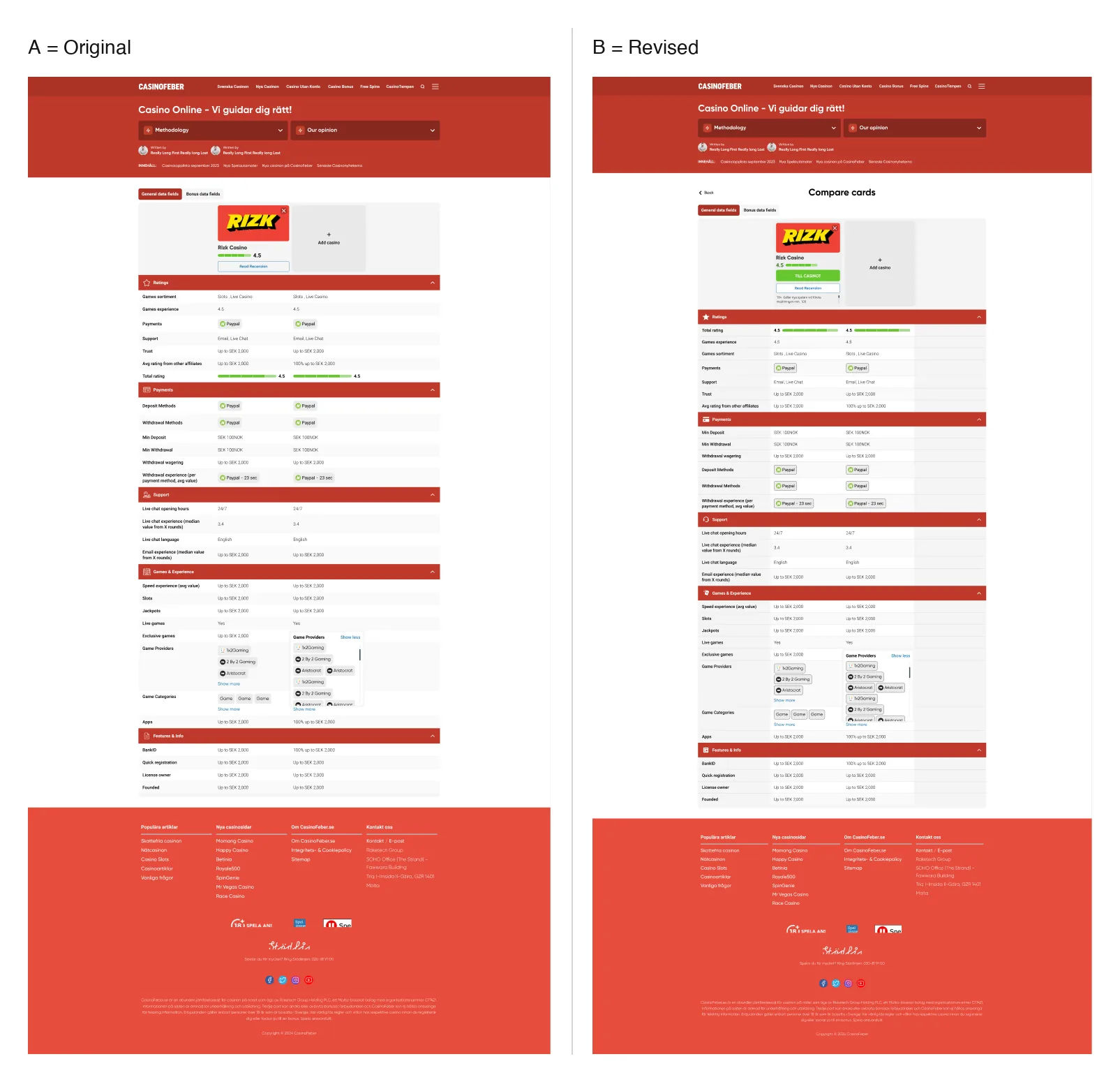 Compare tool, general data fields, Original versus Revised: total rating promoted to the top of the Ratings block, a direct CTA and terms added to every casino card, and a Compare cards heading with a Back link
Six categories instead of six flat links
The main nav held six flat, equally-weighted links: Svenska Casinon, Nya Casinon, Casino Utan Konto, Casino Bonus, Free Spins, CasinoTempen 2024. Nothing signaled what belonged together, matching the unclear-navigation pattern the recordings surfaced.
The nav collapses to six real categories: Casinos, Bonuses, Slots, Reviews, News, Casino Trends, each opening its own dropdown instead of one flat row holding everything.
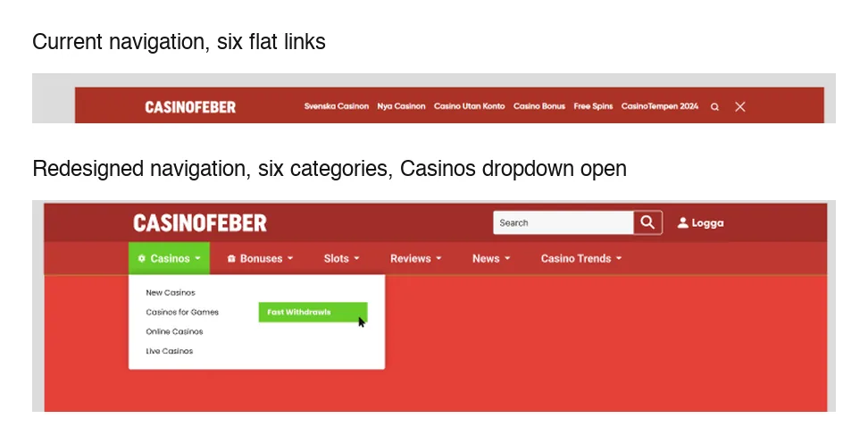 Navigation, current versus redesigned: six flat links collapsed into six categories, shown here with the Casinos dropdown open to New Casinos, Casinos for Games, Online Casinos, and Live Casinos
Design System
One real deliverable so far: the type system. Poppins across the full weight range, a Large Title through H6 scale sized separately for desktop/tablet and mobile, body copy rules for line height, spacing, and tracking. Headline case gets its own rule too: uppercase for section-level titles (Large Title, H1, H2), sentence case for content-level (H2 and below), so writers and developers aren't guessing.
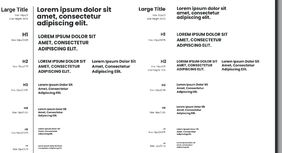 Typography spec: the Large Title through H6 type scale, sized separately for desktop/tablet and mobile
Retrospective
The redesigned variant held up: clearer promotional hierarchy, easier scanning, primary offers and CTAs that stood out instead of competing with equal-weight banners. That structure was selected for further rollout and became the foundation for the conversion experiments that followed.
The same chain ran through every piece of this redesign, not just the homepage test that proved it first: a clearer hierarchy makes content easier to scan, and easier scanning is what finally let the offers and CTAs do their job.