
Overview
Transformera positions itself around optimizing business performance, confident and minimal, built to read the same in print and in product. This is the identity system behind that positioning: a mark, a seven-color palette, a typeface, and imagery rules meant to hold together consistently across every surface the brand touches, not just the deck it started in.
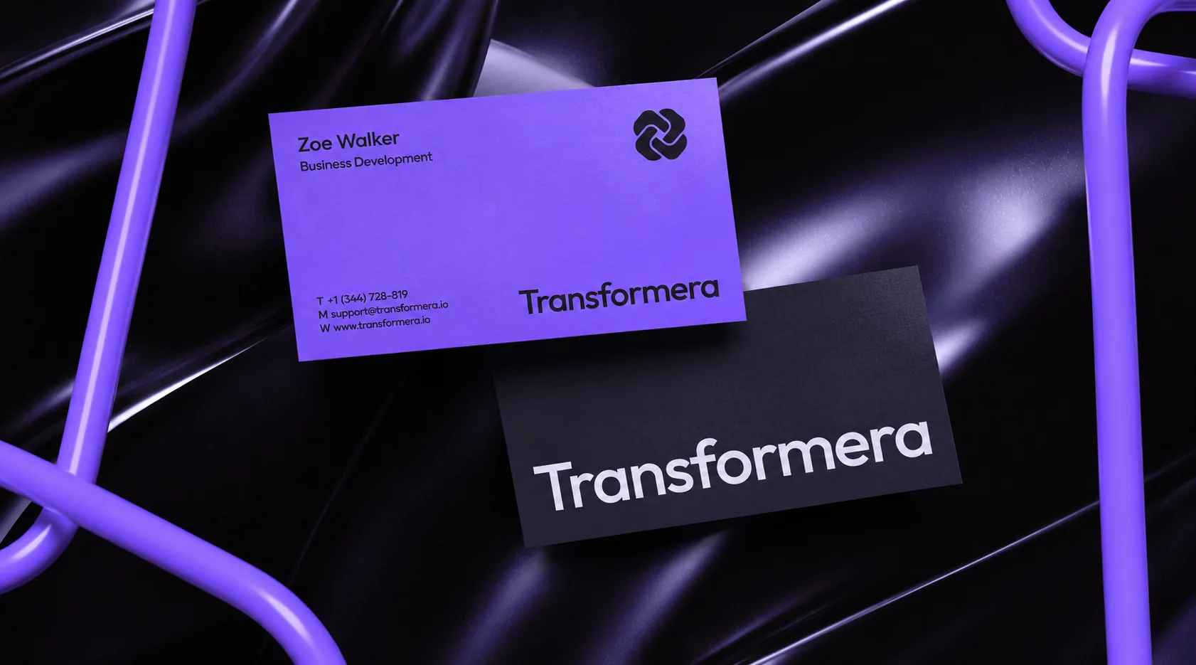 Transformera business cards on a glossy purple-and-black surface, matching the cover's photography treatment
Brief
Transformera's own positioning is blunt, un-glossy: "practical, outcome-driven digital transformation," aimed at SMEs who want automation without complexity, not enterprise buyers shopping for a heavier vendor.
That's also a visual trap: every automation-and-ERP consultancy defaults to the same look, cool blue gradients, abstract connected-node graphics, a wordmark indistinguishable from a hundred competitors. The brief: read as confident and minimal without falling into that register, and hold together from a one-page audit to a full ERP diagram, no second system for the technical side.
Concept
A new identity, not a rebrand: no existing mark to react against. The mark itself carries the idea: two interlocking forms, connection made literal instead of the gear or arrow icon every automation brand reaches for first, the same idea the company sells, fragmented operations into one system.
Restraint follows as an argument, not a style choice: a brand promising to simplify operations couldn't launch carrying a noisy system of its own. One typeface, not two. Seven color tokens, one accent, not a free-for-all. Photography held to two registers, brand gradient or true black-and-white. Everything the system rules out is doing as much work as what it keeps.
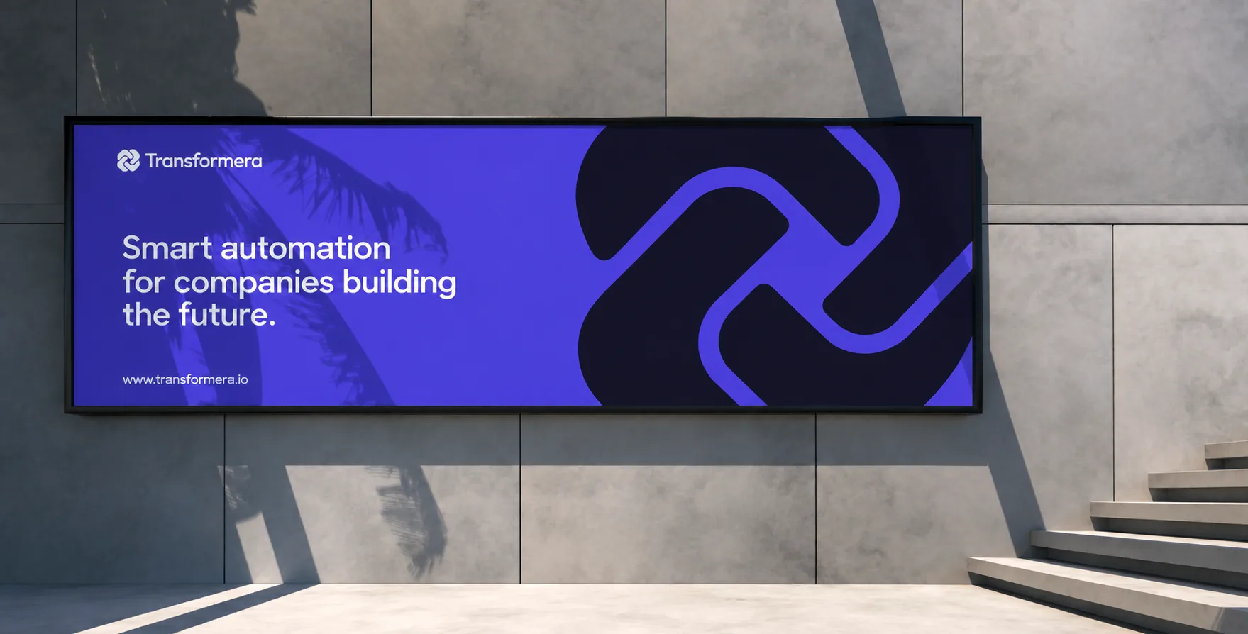 Transformera outdoor billboard: the mark broken apart and scaled up into a standalone pattern, "Smart automation for companies building the future" set beside it on Ocean Twilight
Identity System
Logo
The mark is two interlocking forms, simple enough to read at 16px and distinct enough to survive without the wordmark next to it. White on dark backgrounds, graphite on light ones, the accent green-yellow reserved for backgrounds that need contrast without breaking the palette. Optical spacing is defined by size tier, Tiny through Large, so the mark and wordmark relationship never has to be re-judged by eye.
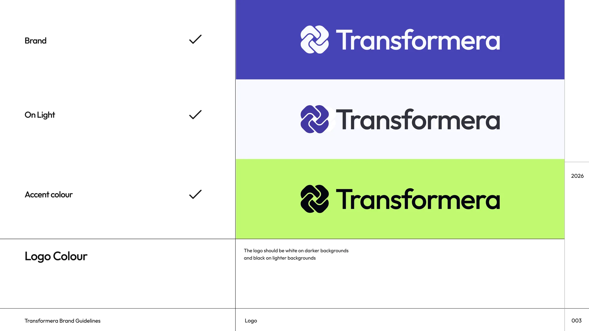 Transformera logo on brand, on light, and on accent backgrounds, with usage rules for stretching, off-palette color, and mixed fonts
Color
Seven tokens: Ocean Twilight as primary, Soft Periwinkle as secondary, Green Yellow as the one accent, used sparingly for calls to action and moments of interaction rather than decoration. Ghost White, Graphite, and Ink Black carry the neutral range. A primary-to-white-to-primary gradient is the one sanctioned background treatment for marketing surfaces, not a free-for-all of brand-adjacent purples.
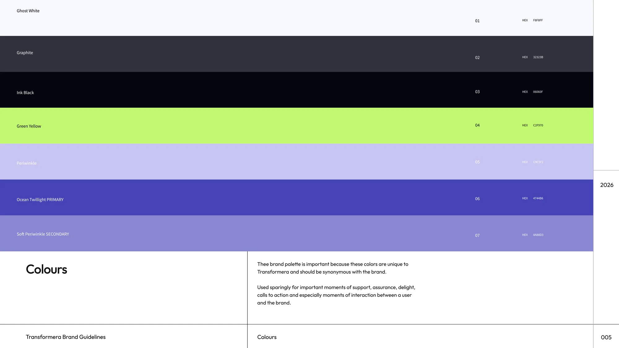 Transformera color palette: Ghost White, Graphite, Ink Black, Green Yellow, Periwinkle, Ocean Twilight (primary), and Soft Periwinkle (secondary), each with its hex value
Typography
Outfit, Light through Bold, chosen as a general-use font for exactly the reason its own spec names: print and digital intertwined, strong, safe, unique. One typeface across every weight keeps the system from needing a second display face to feel confident at large sizes.
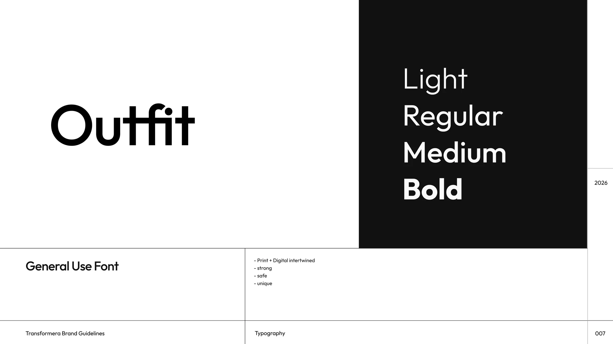 Outfit type specimen: Light, Regular, Medium, and Bold weights
Imagery and voice
Photography and 3D imagery either carry the brand gradient directly or drop to pure black and white, no in-between that would introduce an off-palette color by accident. The voice matches the visual restraint: "Do less. Achieve more."
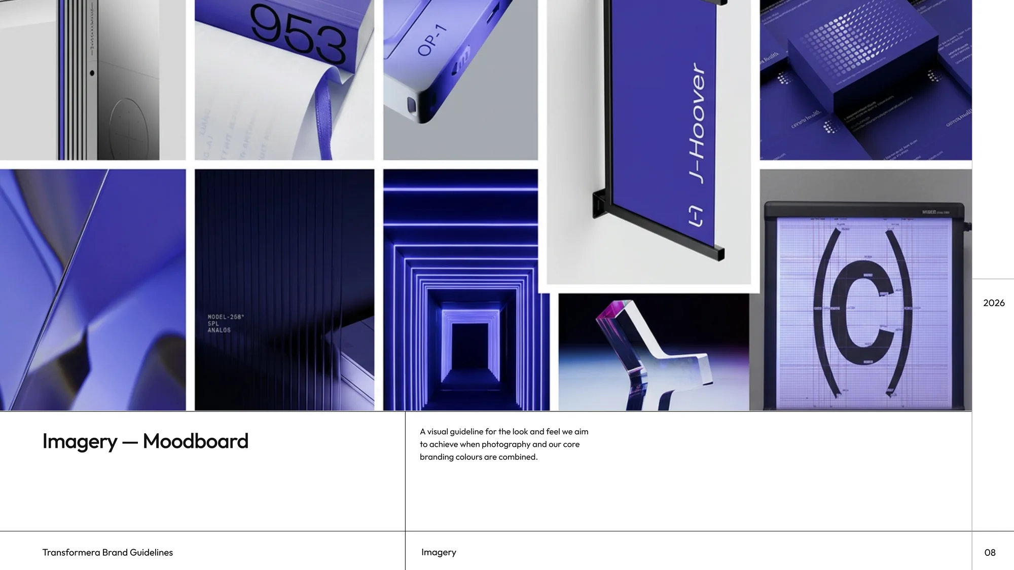 Transformera imagery moodboard: glossy brand-colored 3D renders alongside black-and-white architectural and product photography
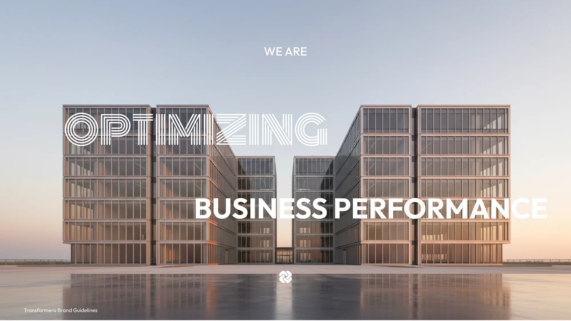 The brand statement, "We are optimizing business performance," set over black-and-white architectural photography with the mark centered below, from the guideline deck's own cover
Closing thought
A guideline earns its keep the first time someone outside the project has to use it without asking a question first, an audit deck, a sales one-pager, a hire's first mock, and the mark, color, and voice all still read as the same brand. That's the actual test for an identity system, not a launch metric.