
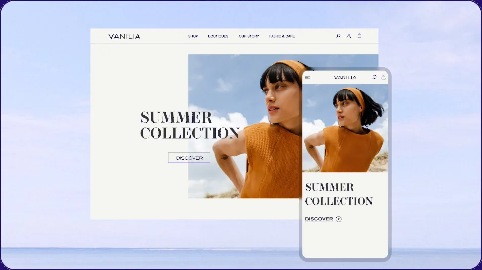
Overview
Vanilia is a fashion e-commerce brand built around one line: "designs that strike the perfect balance between timeless elegance and modern quirks." The homepage already delivered on that: a clean hero, real editorial photography, a confident serif logotype. The shopping experience behind it, browsing the catalogue, narrowing it down on a phone, hadn't caught up.
Vanilia's homepage hero: the reveal on load, "Summer Collection" and a Discover call to action
Problem
The homepage looked the part. Past that hero, though, the experience thinned out:
- Too much visual noise in a 28-item category grid, rows of product photos with nothing to anchor them
- Weak information hierarchy across the catalogue and product page
- Unclear calls to action, buttons that didn't signal what mattered next
- Inconvenient filtering on mobile, category, color, size, and material crammed into a shrunk-down desktop sidebar instead of getting real space
- Not enough product information to buy with confidence, fabric, sourcing, and fit left implicit
Process
The project started from a written brief: target customer (women 20-50, drawn to fashion and sustainability), a full site structure from home through checkout, a USP worth designing around, only limited collections, sustainability as a real constraint, not a marketing line.
That brief became a real content model, down to field types and character limits.
Competitive analysis, reference gathering, and early wireframing worked out image count and layout for the product page across breakpoints before any real design went in. None of those files survive, only the decisions they fed into.
Hero and catalogue directions were explored side by side, a full-bleed editorial photo mixed into the product grid, each tested against feedback rather than shipped as a first draft.
Solution
A catalogue that still feels like the brand
A 28-item category grid risked reading as generic: rows of product photos with nothing to break them up or reinforce Vanilia's editorial voice.
One full-bleed lifestyle photo sits inside the grid alongside standard product cards with real names and prices. Browsing the catalogue still feels like the brand's own photography, not a stock listing.
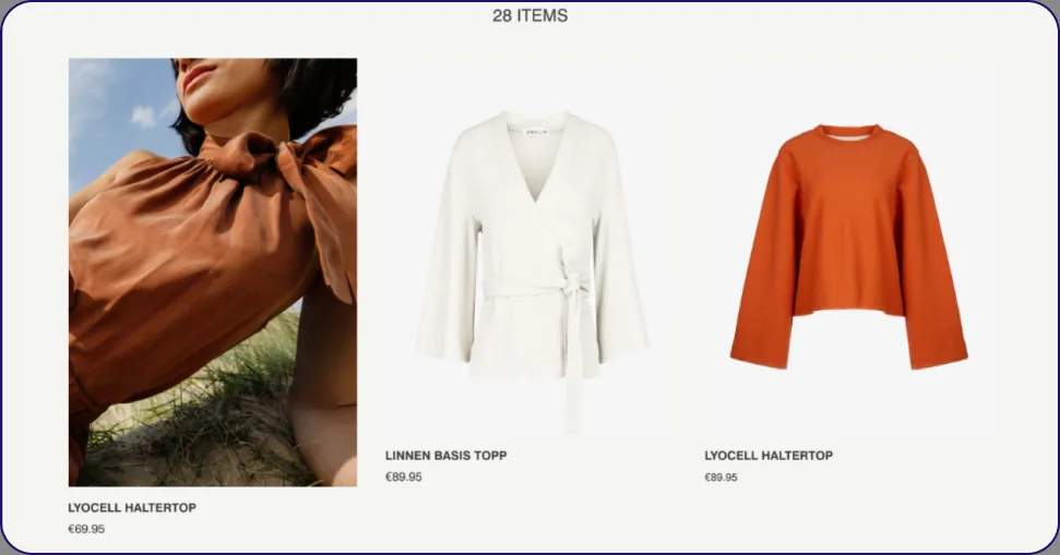 Tops category page: filter bar for Category, Color, Size, Material and Sort above a 28-item grid, a full-bleed editorial photo alongside standard product cards with real names and prices
Filtering, built for mobile first
Finding relevant products meant navigating multiple categories and options, especially on mobile, where filters had no dedicated space.
A structured filtering system: clear categories, sorting, mobile-friendly controls, a dedicated filter panel, Filters and Sort By as equal, thumb-reachable actions right under the header.
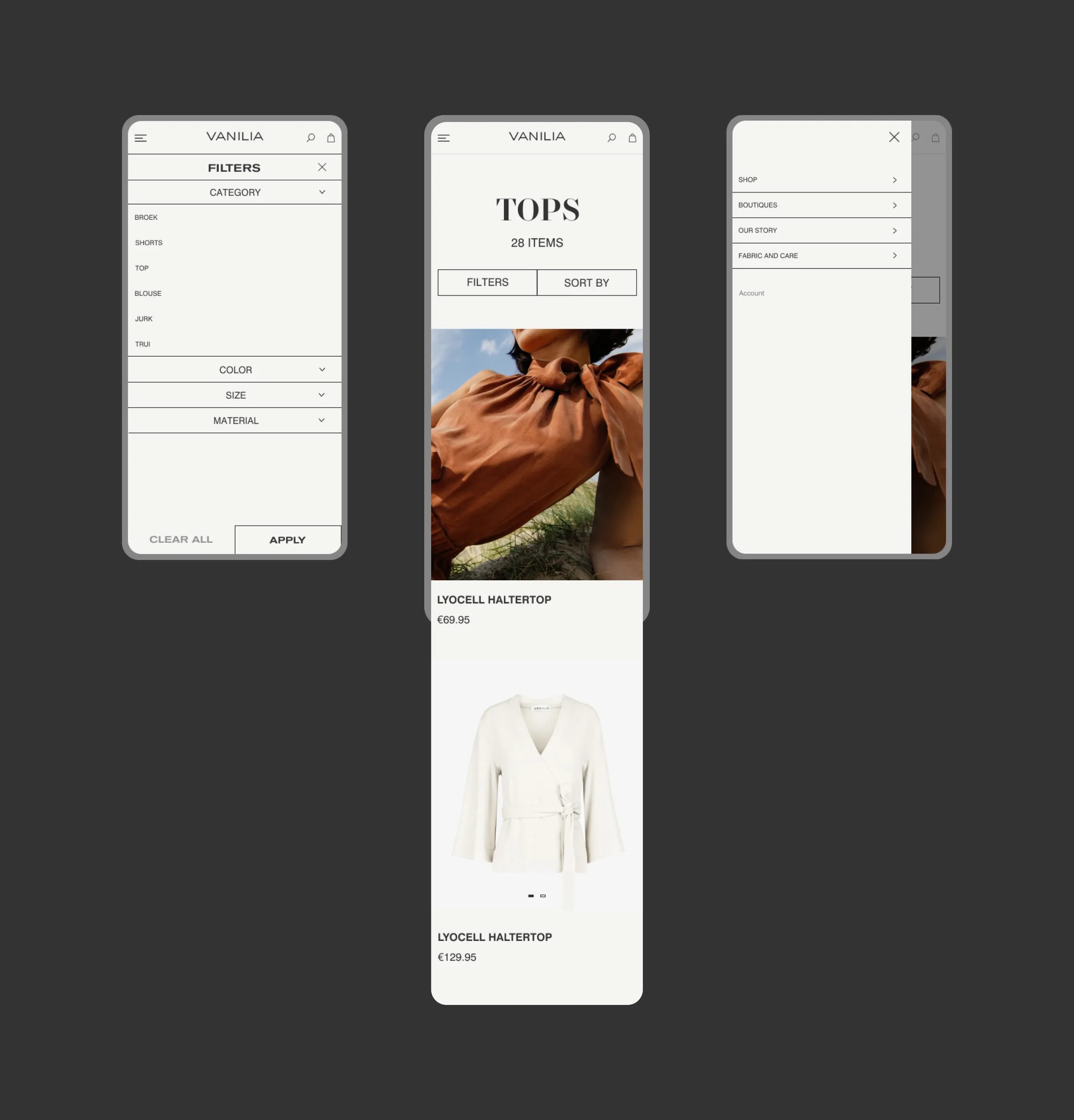 Three mobile screens: the filter panel with category checkboxes, a Tops category page with Filters/Sort By, and the hamburger navigation menu
A product page rebuilt for the new design
Product pages lacked a clear hierarchy between product information, purchasing actions, and related products.
A structured product experience: key purchase information first, full-bleed photography, a clear color and size selector, expandable Fabric and Size details, product discovery and cross-selling built in, not an afterthought.
Vanilia product page: browsing the gallery and adding to cart, with color/size selection and expandable product details
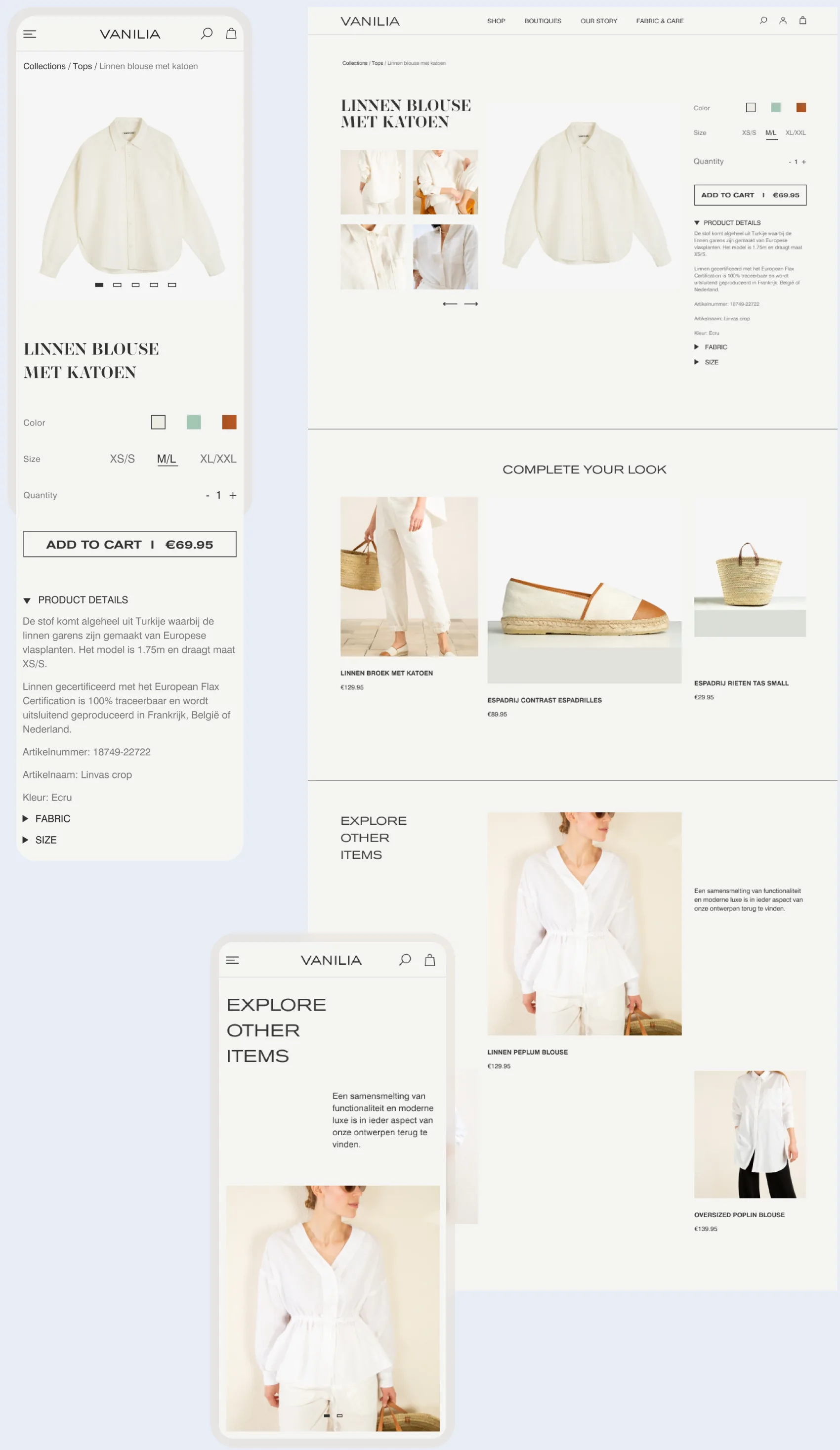 Vanilia product page across desktop and mobile, with Complete Your Look and Explore Other Items sections for cross-selling and discovery
A structured 3-step checkout
A fragmented checkout experience created unnecessary friction before purchase.
A structured 3-step flow, Shipping, Information, Payment, and a clearer order summary made the checkout process more transparent and easier to navigate.
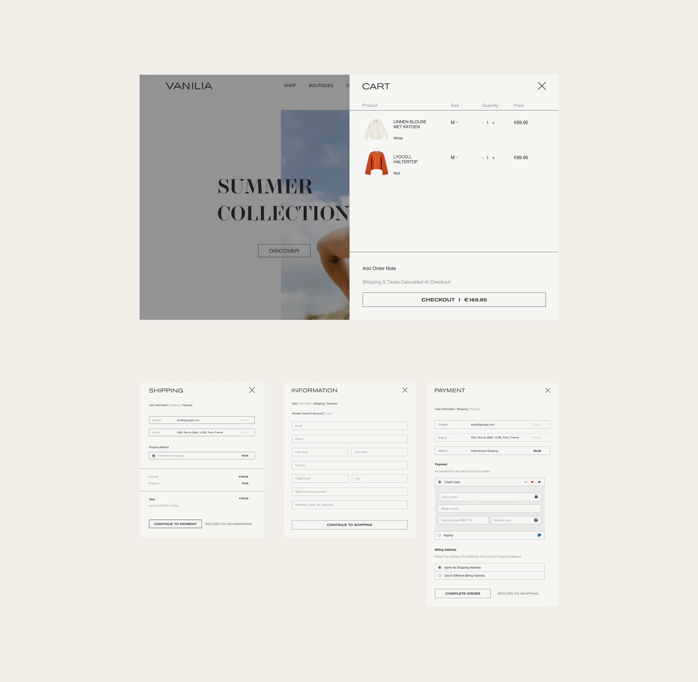 Cart drawer, Shipping, Information, and Payment steps: real products, sizes, and quantities, each step with its own breadcrumb, order summary, and a single clear next action
Impact
The store closed a few years after launch, before any of this could be measured against real analytics. What follows is modeled, not tracked: each number is tied to a specific fix above, based on how that class of change typically moves the metric next to it, not a guess pulled from thin air.
Combined, an estimated +10% conversion rate across the funnel, not a separate lever on its own.
Retrospective
The redesign shipped and stayed in production: filters, catalogue, and product page all working as designed. The shop closed a few years later, a business outcome that had nothing to do with the design holding up.
Testing hero and catalogue directions against real feedback, rather than shipping the first version that technically worked, kept the shopping experience from feeling bolted onto the brand. Looking back, the content model built at the start, SKU, fabric, availability, all defined before a single screen existed, is what aged best: it's why the product page could carry real sourcing and certification info instead of a generic spec list.